
Why Keep Reworking the UI After the Game Is Playable?
Making Games with AI · Part 7
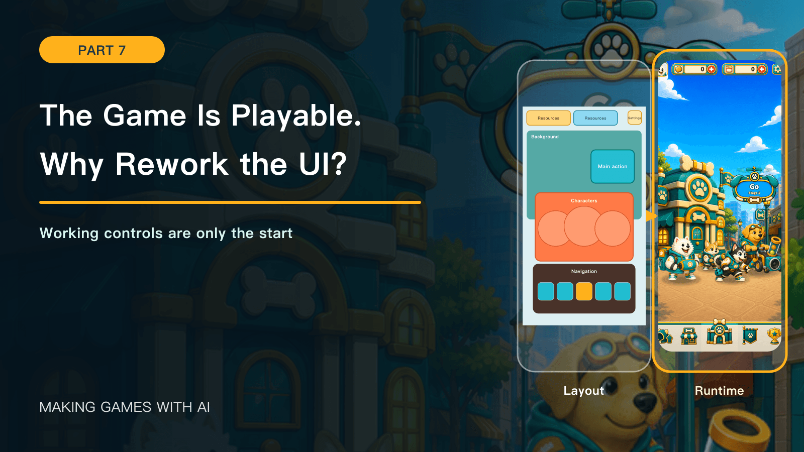
This article revisits development in June–July 2026 and early August, using records through August 2, 2026. References to “current” behavior, values, images, candidates, and validation describe that historical snapshot, not today's released game.
Previous: The First Complete Playable Version
After the first complete playable version, Kibble Street TD could launch, accept a faction choice, enter Home, support upgrades, run battles, resolve results, and save progress. The main screens existed, and their buttons did their jobs.
Using those screens in sequence exposed a different set of problems. Where should the player look first? Was the next action obvious? When resources, entrances, and characters all competed for attention, which should become less prominent? Would a narrower or wider screen preserve the intended reading order?
That was why UI work became more intensive after the game was playable. An interface did more than decorate the gameplay. It organized state, available actions, and the game's visual identity into something a player could understand quickly.
Working features make interface problems visible
The early interface existed to prove the flow. Resource counts appeared, GO entered battle, the bottom navigation changed pages, and settings opened. Connecting those actions was enough for that stage.
Once players followed their own pace instead of inspecting a feature checklist, the standard changed. The question became whether they could identify the most useful action within a few seconds.
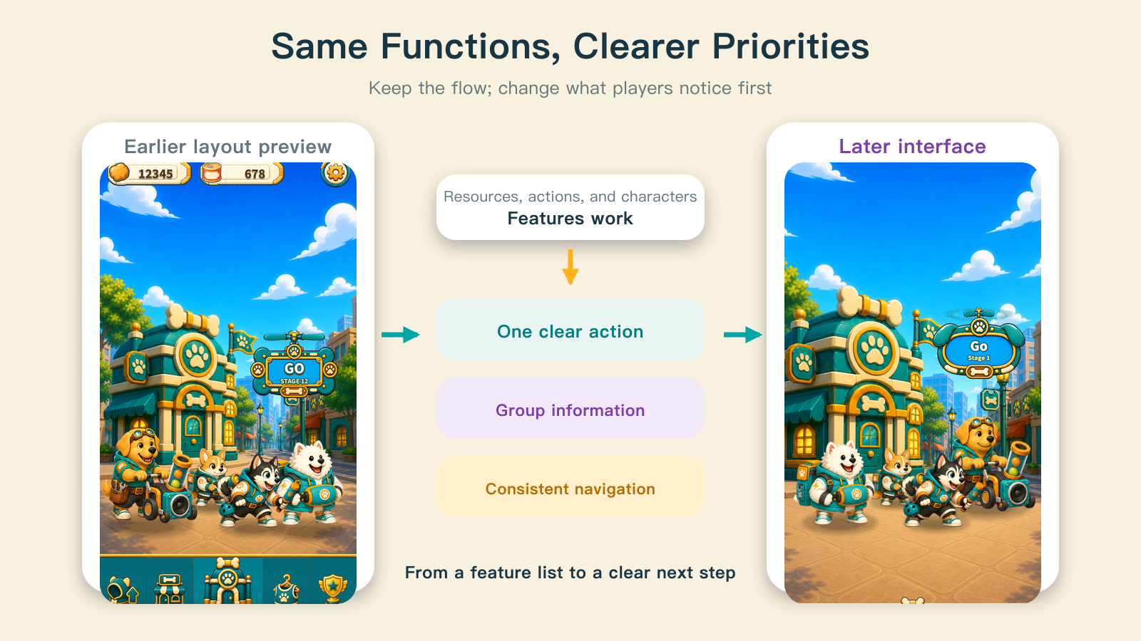
The earlier Home already contained a resource bar, a main button, faction characters, and five bottom entrances. Reworking it did not mean discarding those functions. It meant changing their visual weight: resources together at the top, GO as the clearest action, characters and buildings expressing the faction, and bottom navigation forming a stable system area.
Moving a button, changing its size, or replacing its border was a way to address information priority. Making everything equally prominent produced a feature list with no focal point.
A Home redesign starts before color
Home had undergone at least two overall redesigns, followed by changes to resources, settings, GO, character placement, and navigation. What brought those changes together was a fixed layout, not another elaborate palette.
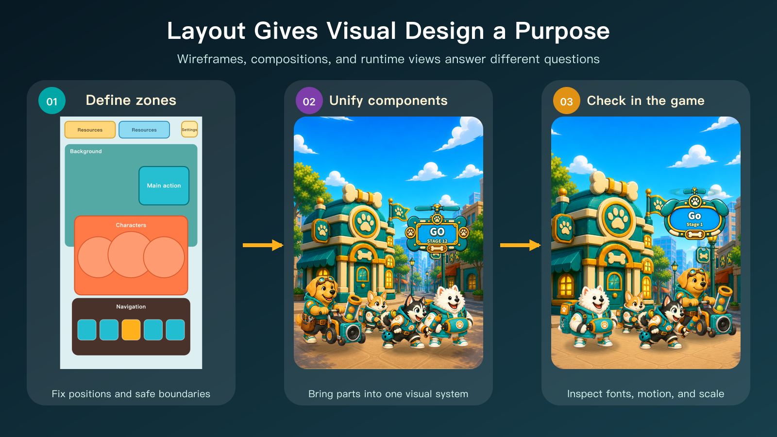
The wireframe answered questions that survived changes in art style: how much space information needed, where the main action belonged, which areas characters could not enter, how tall navigation should be, and where the background had to yield to foreground content. At this stage, the cat and dog interfaces shared those geometric rules while using different colors and faction details.
That also addressed components that looked convincing alone but did not fit together. Settings had looked more like a utility button, and resource bars lacked a consistent structure. Later versions aligned their materials and silhouettes. A more polished component did not necessarily make a more coherent screen; the interface had to be judged as a system.
A shared shell does not mean identical pages
Home, Upgrade, and Shop shared resource information, faction colors, and bottom navigation, but served different purposes.
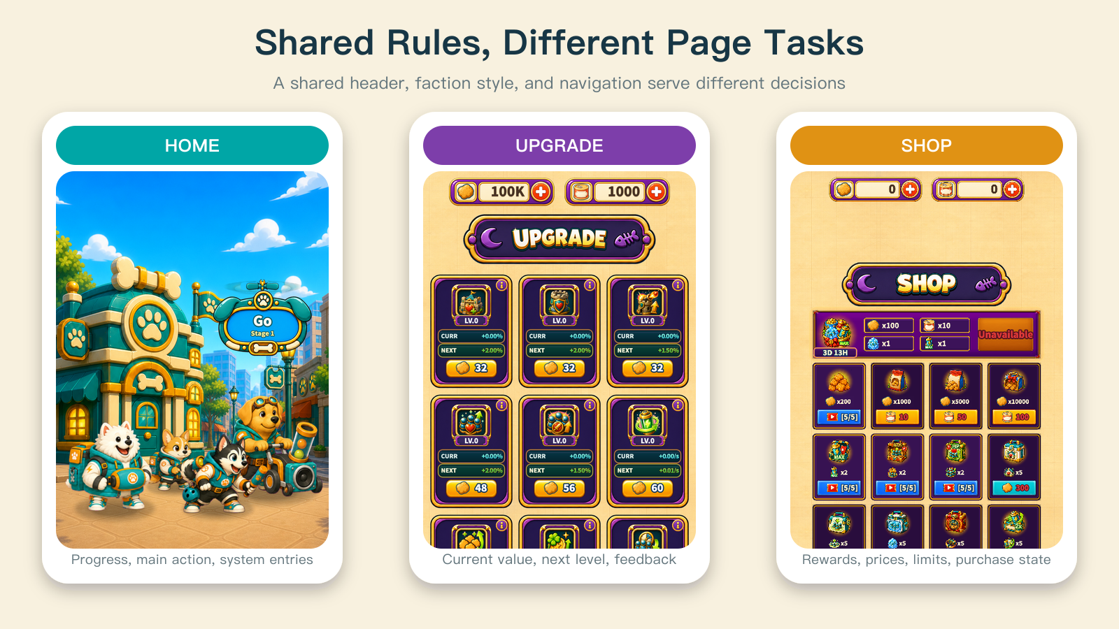
Home needed to establish progress and offer the next fight. Upgrade needed to compare the current effect, next level, and cost. Shop had to distinguish contents, prices, limits, and purchase states at a higher information density. They needed a common visual language without forcing all content into one template.
Adding a value, state, or product could disrupt the reading order even if it only added one line to a card. Reworking these pages meant keeping common rules while making each page's main task visible first. The screenshots preserve the shop and upgrade design from this development period.
Battle HUD space is especially constrained
The battle screen needed faction and base state, stage, speed, and pause controls above; units, items, cooldowns, and energy below; and enough space between them for movement, attacks, and changes along the battle line.
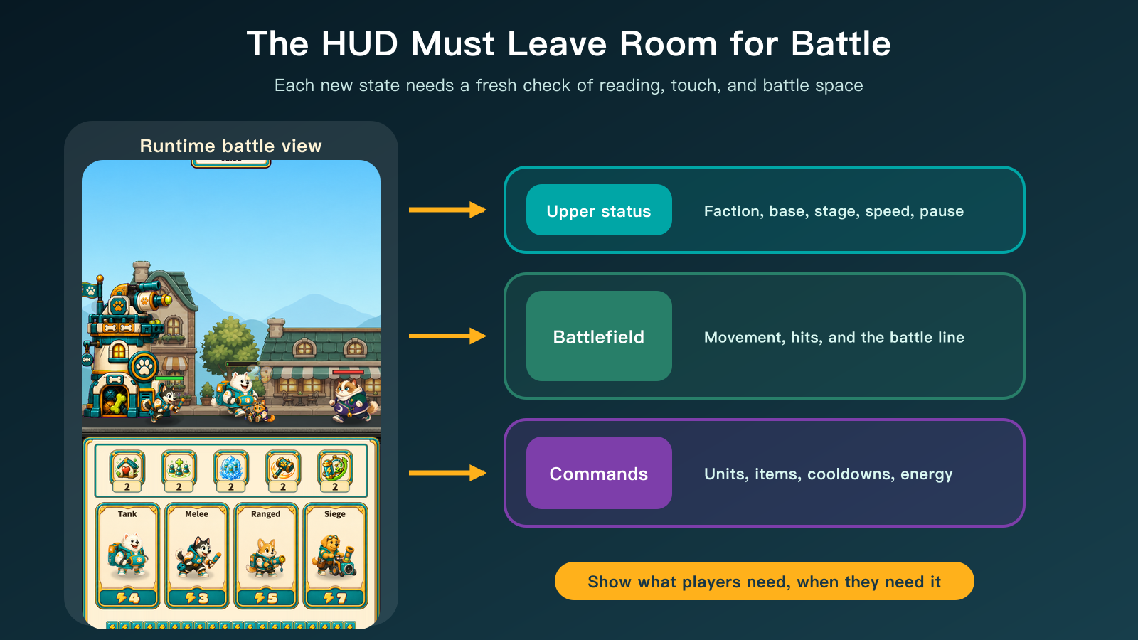
Continually adding information could squeeze combat into a narrow window. Hiding critical state for a cleaner image could leave players unable to understand why they could not summon, when an item became available, or whether their line was collapsing.
The work was therefore a repeated allocation of space among reading, touch targets, and battlefield visibility. New battle rules required checking the HUD again; an existing layout could not be assumed to accommodate every new state.
One design does not prove every screen
The interface described here used a 1080×1920 design reference. Foreground content kept its proportions and remained centered, while the background filled the available area independently. Upper interactive elements also respected the device's safe area. The objective was a consistent composition and action order, not identical pixels on every device.
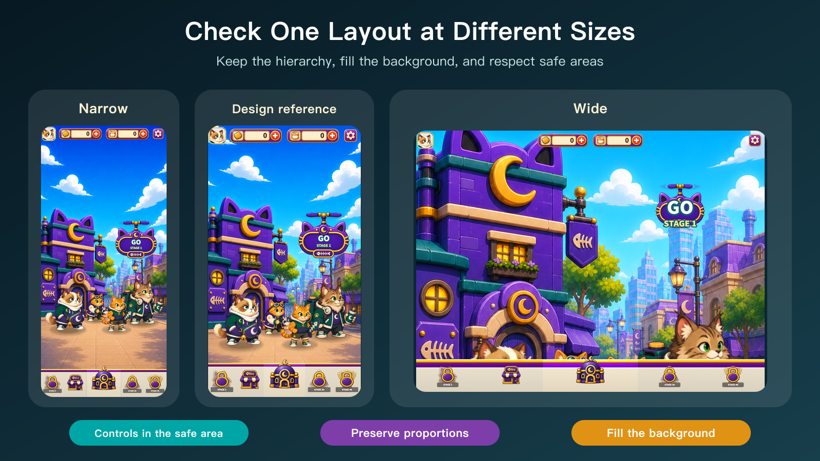
Narrow screens exposed shortages of vertical space. Wide screens exposed insufficient backgrounds, dispersed content, or buttons drifting from the visual center. After changes to top bars, navigation, or full-screen backgrounds, those different proportions needed another look.
Correct component dimensions were only the starting point. The interface was ready when players could still recognize the same priorities across the intended screens. These captures document selected browser sizes, not complete validation on every physical device.
AI reduces rework cost but cannot supply judgment
AI could help with repetitive, checkable work: inventorying screens and assets, preparing dimensioned wireframes, assembling previews at approved coordinates, checking image dimensions and transparency, comparing faction component structure, and capturing different aspect ratios.
The human still decided the page's primary task, which elements should recede, which visual direction to choose, and whether a revision was worth its cost.
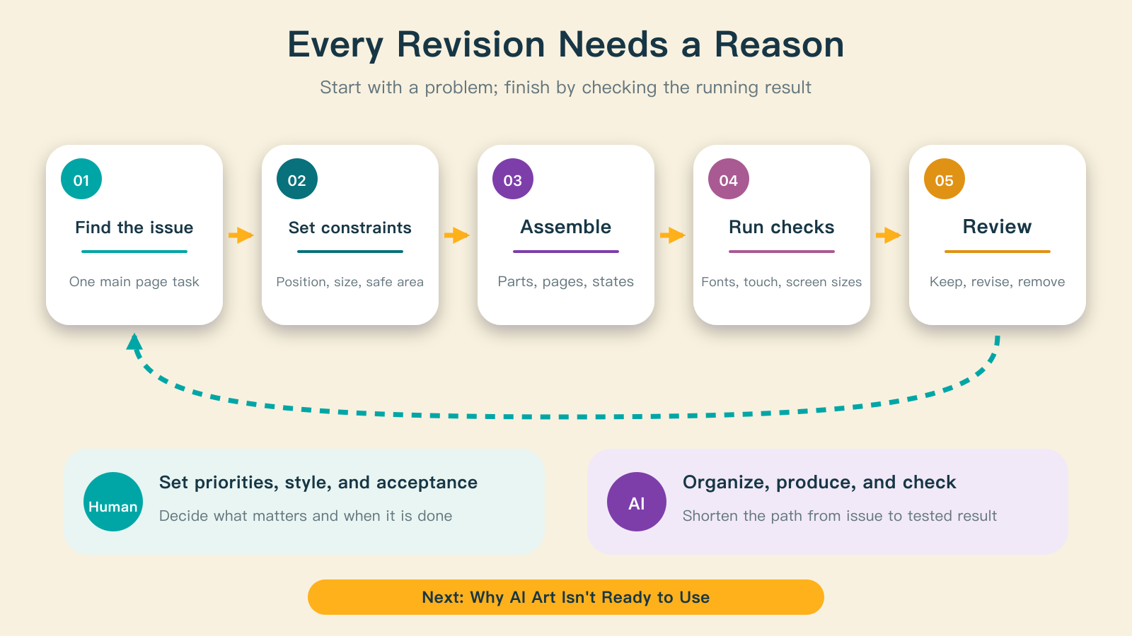
This division did not make the first version automatically correct. It shortened the cycle from observing a problem to defining constraints, producing a version, running it, and judging again. Without priorities and acceptance criteria, faster iteration could simply produce inconsistent candidates faster.
Who is responsible for this part?
The human defines page goals, information priority, visual direction, and acceptable tradeoffs, then approves the wireframe and running result. AI turns those decisions into dimensions and constraints, prepares comparable previews, performs deterministic processing, and checks sizes and asset consistency.
Neither can skip runtime verification. A wireframe shows intent; a static preview shows the composition. Running screens reveal the effects of fonts, animation, touch input, safe areas, and actual aspect ratios.
Where to start
Choose a frequently used page and name the single most important action after entering it. Sort its information into primary, secondary, and supporting roles. Build a gray-box wireframe and inspect it at two clearly different aspect ratios. Invest in components and visual detail once the reading order holds up.
Reworking the interface after reaching playability is part of moving from a working system to a game players can understand.